

August 3, 2015
•Last updated November 5, 2023
Stop it!
Have you ever visited a website or blog to find that it’s almost completely impossible to use due to factors like too many display ads, annoying overlays or paginated pages of an article? That stuff is terrible for conversions and how you should tailor your content to get the best out of your users’ experience. Without your users, you’re never going to get anywhere so Stop it!.
I’m not the only voice in this matter. As a pre-requisite, I recommend you to check out Brad Frost’s thoughts as well as his talk titled Death To Bullshit. While his post is a year old already, too many websites are still practicing these bad habits. Why the hell do you want to annoy your users? Earn their trust the real way and you’ll get where you want to be.
This post is a collection of all the annoying techniques many websites try to either get you to opt into something or just try to keep you on the page longer. Let’s stop this madness by calling the guilty parties out on their crime! Again if you’re one of them Stop it!
Before I digress, yes this blog has display ads. You’ll find that most do. My goal is to not obstruct the content. I’ll never employ an overlay approach to getting you to sign up for a newsletter or some dumb bullshit. This is my promise to you, the user. Ok, now read on!
The Infamous Overlay
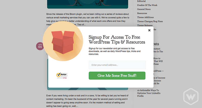
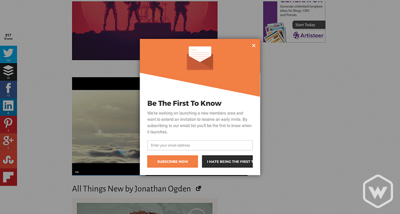
You’ve all experienced these pieces of shit. You visit a website and in about one minute or less an annoying overlay pops up to get you to try and opt into something you don’t want to. Usually, this is an e-mail newsletter subscription form or something you could easily have displayed somewhere else on your website but NO let’s put it in an overlay and keep the user from doing what they came to your website for in the first place. I don’t want to like your Facebook page or download a freebie either so Stop it!.
Mega Distraction Overload
Quit overloading the user. They can't even read the content. What makes you think they are going to stick around?
When I visit a website I want to see information (the whole point of the internet). Please for the love of God, don’t show me endless amounts of ads in the content or in between the header and footer of the page. You’re trying too hard and totally distracting from the content itself. Check out the image and count how many distractions you have to try and ignore to view the content you wanted to see in the first place. Stop it!
Don’t Paginate An Article
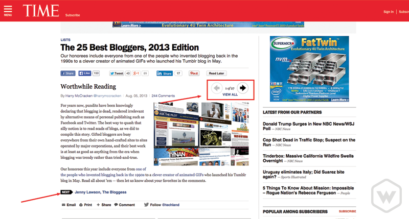
We get it you want more page views and impressions. Do we care? Hell no!. If you’re going to write articles for the masses then let the masses read it as a normal human being would. Top to bottom left to right (in the U.S.), a group of words together in a sentence. Groups of sentences are paragraphs. This is called reading. Hell, even throw an image in there if you want. This is what we want. Not what you see over at time.com. Stop it!
Where The Hell Is The Content?
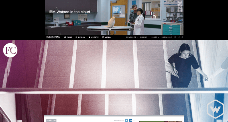
I have no idea what I'm looking at here...
I should not have to scroll to see the content I came to see. Making a website look cool is one thing but making it completely unusable and annoying while doing so is another. Way to go Fast Company. First off, there’s a nice massive ad above the page header. That sure seems annoying. Second, for some reason they thought adding a huge image at the top of each article seemed like a good idea. I wonder if they thought about each user having to scroll each and every page visit? This alone keeps me from ever visiting this website other than to prove this point. Yuck! Stop it!
Page Speed
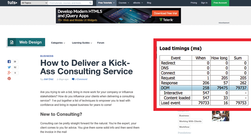
Pretty astonishing that a blog about web design has terrible page load times.
Some ads are ok but when I have to wait extra time so your 100 display ads to load in order to view the content I came to see you can be that leaves a sour taste in my mouth. I doubt I’m the only one. This page over at webdesign.tutsplus.com took me a whopping 79 seconds to load from start to finish. What the hell? Stop it!
Too Many Cooks In The Kitchen
Your blog needs content yes. What it doesn’t need is a massive amount of categories of content. I don’t want to sift through business articles to get to design-related articles. Your content will be way better if you choose to stick with a few categories you specialize in. No blog has ever succeeded by writing about absolutely anything. Refine your content to a niché so your users can benefit and also put trust towards the fact that your content is legitimate and not just a pile of garbage. Stop it!
Sponsored Posts
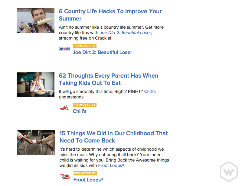
If the content is useful these may be ok but most likely someone just got paid and you or your users suffered as a result.
Sponsored posts are just as good as any blog post, but they are also pretty damn annoying. A lot of well-established blogs go this route for compensation from the author in return. I get it, we all need to keep the lights on but is it truly necessary to distract your readers with some one-off post about some product or service they probably won’t be interested in anyway? I’m torn on this approach. While it's win-win for both the blog owner and sponsor I can’t say that the user benefits much so I suggest you Stop it!
Autoplaying Video/Audio Ads
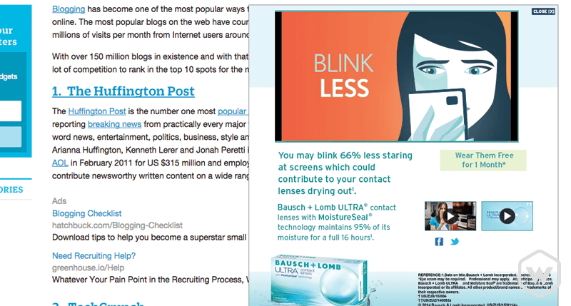
Seriously. Stop it. I don’t even need to explain why.
Finishing up
In the end, a website that produces content at a rapid rate needs to monetize somehow to stay in operation. I think everyone understands this concept, but the way bloggers are going about it this day and age is pretty ridiculous. So many methods of utter bullshit are thrown at you like garbage. Why is it so hard to find the information we want? Why make it such a challenge? Is it truly worth it or are you just trying to annoy your users? If you are then please Stop it! and I'll add another Stop it! for good measure. Sheesh!
Categories
Products and courses
-
Hello Hotwire
A course on Hotwire + Ruby on Rails.
-
Hello Rails
A course for newcomers to Ruby on Rails.
-
Rails UI
UI templates and components for Rails.
