
November 5, 2015
•Last updated November 5, 2023
The State of Free Stock Photography
Photography is becoming easier and easier to get your hands on these days. Websites like Shutterstock or iStock are no longer dominating digital photography market. While free photography is an amazing resource for us designers, developers, and writers, to me it seems as though it is being completely taken advantage of.
Blogs and applications are making use of the same photography to create their own ideas and thoughts. This is causing a lot of repetition of certain photos around the design, development, and writing community which makes things just plain boring. Check the featured image at the top of this article if you don't believe me...(seriously what do some logs have to do with anything?)
I write this article as a purely opinionated voice. I myself make use of free stock photography for the sake of saving a buck (probably like everyone else). I’m not saying don’t use free stock photography. All I’m trying to get across is that you should use it wisely or in moderation like everything else in this world.
Sometimes purchasing photography or going out and taking photos yourself is a better way to support whatever it is you are trying to support. Sure, I could get an account with a service like Shutterstock but sadly the rates are steep. Though when you think about it, the pricing model makes sense as the photos are taken by real photographers trying to do what they do best. On top of this they need to make a living, but for me to buy in would mean I absolutely needed the photo(s).
This State, That State, Many States
The current state of free stock photography is bleak. Too many photos are getting used over and over endlessly causing me to lose a lack of faith in some blogs or apps.
I first got introduced to the idea of free stock photos when I have shared the one we are all probably most familiar with, unsplash.com. At first, I loved this resource. I thought to myself,
“No longer would I need to hunt to find some wonderful photography”.
Then like a year or two passed I began to notice how repetitive the site was. Much to my dismay, I couldn’t continue to use the photography in my work as I was seeing it all over the internet. I certainly can’t complain that much because the photos are free, but the subject matter of each photo is pretty much the same week to week. If you want to find some great landscape or nature-based photos then look no further than unsplash.com.
Subject Matter
New sites are popping up every day showcasing the lasted free stock photos all of which are very similar. Upon the birth of unsplash came many more sites:
- Startup Stock Photos
- Folkert Gorter’s Superfamous Images
- Splitshire
- Death to the Stock Photo
- New Old Stock
- Picjumbo
- The Pattern Library
- Gratisography
- Getrefe
- IM Free
- Jay Mantri
- Women of color in tech
- Public Domain Archive
- Magdeleine
- Foodiesfeed
- Picography
- Raumrot
- ISO Republic
List credit - @dustin
All of these resources offer different but similar stock photos free for use (some with attribution requirements). There are more sites popping up every day that offer similar photos and resources. This pattern continues with websites offering digital goods, videos, and any other type of media.
Sadly, the concept of originality is rapidly declining as people are more worried about finding a cheap or free resource rather than working to make something completely original for their own purposes; something that actually supports their design or voice.
The biggest takeaway I can give you is to ask yourself if the photo actually supports your design or content. If it doesn’t, you are likely better off without it. It is far better to strip away than to add meaningless content or features to a website or app. If your reason to use that stock photo everyone else already uses is for the sake of ” looking beautiful” then you may want to rethink your venture. It’s already been done.
Framework Madness
Gone are the days of being creative from the ground up. A lot of new websites or apps start with a framework or a free photo rather than a truly original design idea. Frameworks such as Bootstrap or Foundation cause many sites to look and behave the same way. This bores me as a web designer, I love what’s available from a framework but hate how over time all websites that make use of them look the same.
Does it make sense to use a framework? Of course, it does. The issue lies inside the fact that no one is willing to create something out of nothing anymore. Using a framework saves them time and headache so it makes sense.
Tech Fights Back
People want results fast no matter what it takes. This phenomenon grows worse each day due to technology becoming more powerful and faster than ever before. Don’t believe me? try driving in rush hour traffic and finding someone who is enjoying the wait. Or God forbid your phone only has one bar of service. Technology simply forces used to be lazy.
Supporting the trend
A lot of up and coming apps support the free stock photography trend by making direct use of it. Whether they knowingly make use of random stock photos or not it makes me wonder if they thought about how these photos actually relate to whatever the user will be using them for.
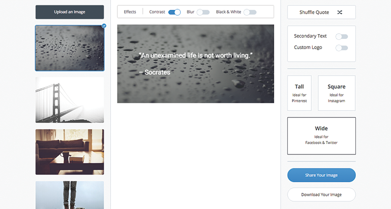
Pablo by Buffer recently launched as a tool for creating photos to use as an engagement tool for social media and blog posts. While the concept and functionality are terrific you’ll notice it makes use of free stock photography at its core.

The app itself overlays whatever your blog title or quote is over a pre-determined photo in which you are able to share or download. Keep in mind that you can upload your own photo but again by default you’re stuck with free stock photos that don’t have anything to do with whatever you’re blogging about. That is unless you’re writing about nature or landscape photography...
This is an example of only one app, but there are other sites out there. The most common pattern I have seen free stock photos used most are resource-based sites that use them without a second thought.
Final thoughts
Simply using a free stock photo can make a design look great, but in the real world, it needs to be relative to the content at hand. If there’s no relation you will likely lose your user’s attention fast. As a designer who can spot a free stock photo fairly quickly, I feel as though we are overextending our welcome with free stock photography.
Photos are meant to better engage the on-looker. The snap a moment in time and allow you to better visualize the subject matter at hand. Messing with that visual experience can force you to shoot yourself in the foot.
I get put off by design if a free stock photo is a focal point simply because It seems as though less thought went into it, even if that’s not even the case. I feel this is a result of the overuse of free stock photography around the web. What first seemed amazing and cool turned into something rather boring and predictable.
In the end, image sells whether you like it or not. Whether it's a photo, video, or kickass design, people will always be attracted to beauty. If you’re going to leverage free stock photography in your work you better make damn sure it’s being used both tastefully and within reason.
Categories
Products and courses
-
Hello Hotwire
A course on Hotwire + Ruby on Rails.
-
Hello Rails
A course for newcomers to Ruby on Rails.
-
Rails UI
UI templates and components for Rails.
