

May 25, 2015
•Last updated November 5, 2023
Why Emotion Is The Secret Ingredient To Successful Design
Taking a stab at what your users or peers should get from a design or piece of art is like a shot in the dark. Like most art, there is room for interpretation but that is express by each and every onlooker as opposed to the original artist who created the piece.
In the design word, be it digital or print, designers can create the same impact through emotion by offering organic characteristics that attract or engage more users. A large part of creating an emotional-based design is coming through the web and app world. Many of your favorite applications or websites use specific designs to target users like you into experiencing a new perspective through their design.
This post explains how emotional design can be a great outlet to provide users with a richer experience than they thought was possible. Everything from product packaging to application design and animation can be used to deliver outstanding results.
What Do You Mean By Emotion?
Emotion, as defined by good ole’ WikiPedia, means, a person’s state of mind and instinctive responses. Translating that into design means something that is memorable or provides a feeling as opposed to just a bland experience.
Budweiser Liberty
The images below express a feeling of patriotism during the summer months of 2015. Budweiser, an American-made beer, sports new packaging for a limited time to express the importance of the season and what we fought many years ago to call the land of North America our own.
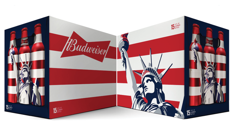
Images via http://thedieline.com
Art by Jones Knowles Ritchie
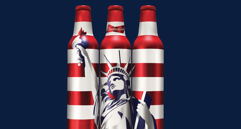
Images via http://thedieline.com
Art by Jones Knowles Ritchie
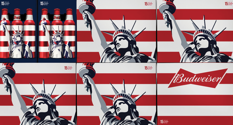
Images via http://thedieline.com
Art by Jones Knowles Ritchie
Packaging can create an impulse for any consumer to either buy a product or choose it over another. The way a product presents itself is just as important as its functionality or quality. Manufacturers and distributors use emotional design to stay ahead of the pack by offering something fresh and exciting through its branding. Doing so may be costly but the end result is something that lives on with the brand and isn’t overlooked by consumers.
Mailchimp
In the web world, the same rules apply to emotion. While the current trend is to present your website in a clean and minimal(flat) manner, it doesn’t always mean you have to follow the same lead.
Introducing a personal element such as a mascot or stylistic touch that stays with the user as they navigate the website is a great way to win over users. Mailchimp does this extremely well with their chimp mascot. The website today features small quirks that present animals as mascots to keep the experience more organic. Users will view this as memorable and even slightly humorous or fun which helps extend their trust in the services Mailchimp has to offer.
Web-Crunch

On our own site, we have a baby T-rex with big teeth as the mascot. Since the name is web-crunch we took the liberty to using a mascot to deliver a more emotional experience to our user base. Doing this over time will provide a memorable experience that is fun and a little humorous to boot. Going one step further, if you navigate to a page that doesn’t exist on the site you’ll find a big bite out of the web-crunch logo. Try for yourself.
The Importance Of Usability
Having an attractive design certainly helps express rich emotion to your users, but when it comes to designing your product, you have to pay attention to usability. If the product/service/experience is flawed, users will quickly change their minds about their views towards them. Avoiding this pitfall is the necessary first step when designing for emotion.
In terms of web design, usability is one of the most important factors in achieving a consistent experience through emotion. Using tactics that make a user feel personable, for example, is a great way to give you that warm and cozy feeling. Ways to achieve this could include:
- Loading animations for longer loading web pages
- Personable error messages or alerts
- Success messages when something completes
- Mascots or step-by-step instruction to help people figure things out fast
- Keeping navigation always in view
- Limit scrolling and page load times
- Making the experience as minimal as possible
Basecamp
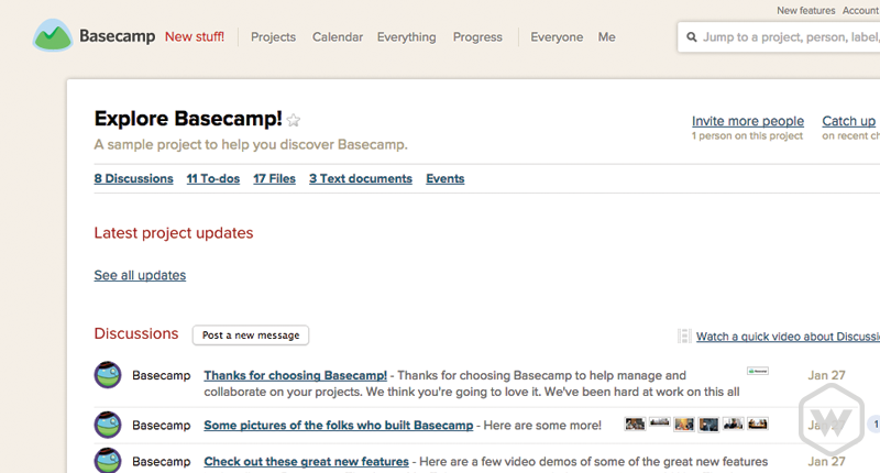
Basecamp is a project management tool that was ahead of its time. Focusing on the experience is the primary goal so the makers made it rather simple in terms of emotional design. Keeping this simple means less clutter and more doing which is the exact intention of the application in the first place. The functionality of the application is huge but you wouldn't notice that at first glance until you dive in and start using it. I use Basecamp for my own projects and find it to be a pleasurable experience.
Remember that emotional design doesn't always mean designing with the use of textures, lots of colors, mascots, and more. You can also create emotion by subtracting elements or aesthetics from your interface. Basecamp started this way and continues to lead by example.
Wufoo
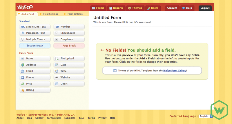
Wufoo is on the opposite end of the emotional spectrum in terms of design. The application authors provide a unique experience that is exciting and fun. Every message or graphic is playful in a way that invites you in. Using the form builder tool makes doing work fun and easy. Everything from the page background to the company logo screams emotional design which is what the authors were going for. This design accompanied by great usability makes Wufoo a fantastic tool for anyone looking to build a custom form for their website or application.
Discovery
Some applications or products give you room to discover. Doing this allows you to quickly learn the tool or interface and create your own experience. Anything from a simple search or categorization makes all the difference in how you use a product or service.
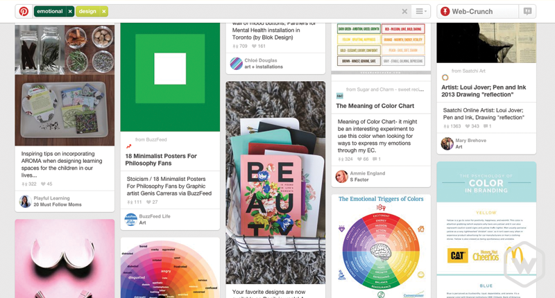
Pinterest is a great example of a discovery-based application. The sole focus of Pinterest is to Pin (discover) images or websites a user likes. You can have different boards full of different types of pins. Finding the pins you may want to keep track of is easily done through a large search form at the top of the page. Notice how the search and other settings always stay in view so you can get immediate access if needed. Discovering new pins is as easy as performing another search or scrolling through the results that appear.
Spotify
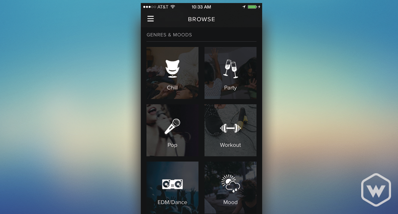
Spotify has different designs for all of the platforms it supports (the web, mobile, etc..). On all of these platforms, a user can discover new music based on the mood he or she is currently in. Rather than knowing an exact artist to search for, a user can now simply discover based on their mood which to me is a really neat feature coming from a music lover! Spotify takes discovery to a whole new level by making it a big part of its initial navigation.
Reward
If you have ever taken online course chances are your progress is being tracked. After successfully completing a course, students are typically rewarded. Online schools or interactive courses tend to follow this paradigm. Doing this allows a user to feel a sense of accomplishment. Obtaining a reward promotes further progression and less hesitation. Users want to feel welcome and safe enough to proceed without running into conflicts or errors. If errors come about then the necessary information needs to be presented in such a way that doesn't cause panic.
Treehouse
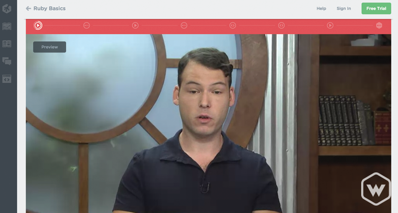
Team Treehouse offers online courses to those interested in learning about web design and development. Through each course, a user is tracked for their progress. The course consists of a series of videos and challenges to help you learn a specific skill set along the way. If you make it past a set milestone you receive awards or badges to indicate you've made through the course. Receiving a reward means you are one step closer to learning your new skill and being able to master it effectively.
CodeSchool
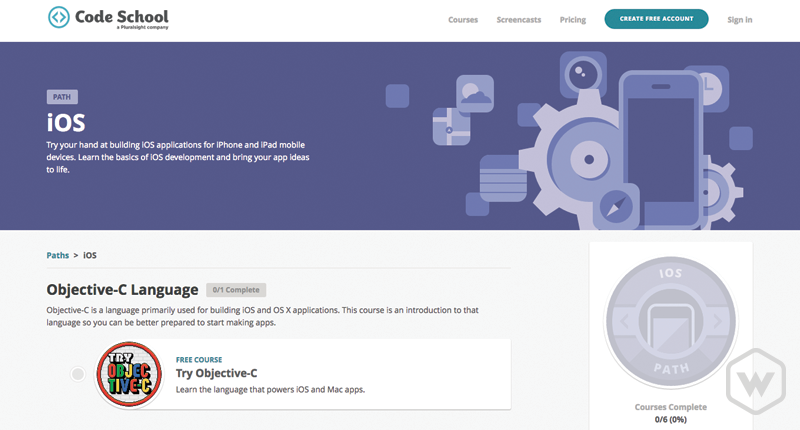
Much like Treehouse, Code School offers online courses that teach you along a path of tutorials to learn a specific skill set. The big difference between Treehouse and Code School is simply how they teach. Treehouse seems a little more like a classroom-based experience (similar to a university) and Code School takes that concept by adding a few unique quirks such as illustrations, animations, and fun videos to help you along the way set to a particular theme. Try the Rails For Zombies course for free and get a general idea.
Tangible Rewards
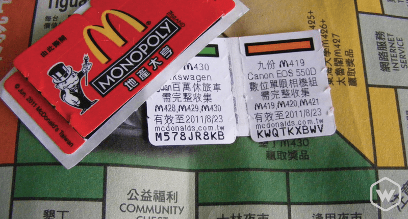
If you're from planet Earth you have probably heard of the popular company called McDonald's. Every year the company re-introduces its Monopoly sweepstakes that allow their customers to participate in a chance to win a multitude of prizes. Buying more of McDonald's products earns any customer a better shot at winning prizes.
The key to making the sweepstakes work successfully is all dependent on the product packaging. The paper-based containers that hold food or drink served by McDonald's features peel off monopoly pieces that you can collect to later try and win. As long as you know how to play Monopoly and can stand to eat a lot of McDonald's, your chances of winning something(even if it's more food) are fairly great.
People across the world look forward to sweepstakes every year. Over time, it has become a tradition for people to purchase more food from McDonald's during the sweepstakes. McDonald's marketing plan proved and continues to prove to be a grand success.
Emotional Pitfalls
Emotion will always come with risk no matter the design or application. People view things in different ways. Some will love a redesign and others will hate it. If you can outweigh the bad with the good then your bigger user base will follow you as you introduce your new design using emotion.
Some people will always knock progression but without progression just think about where we would be today if it didn't take place.
Some Further Reading
- Emotional Design: Why We Love (or Hate) Everyday Things
- A Book Apart - Designing For Emotion
- Smashing Magazine Article
- TNW - The Importance Of Emotion In Design
Feature image via iStock
Categories
Products and courses
-
Hello Hotwire
A course on Hotwire + Ruby on Rails.
-
Hello Rails
A course for newcomers to Ruby on Rails.
-
Rails UI
UI templates and components for Rails.

