

August 21, 2016
•Last updated November 5, 2023
Use Bootstrap to Recreate the WordPress Menu Nav
This past week I needed to make use of Bootstrap alongside WordPress. I needed to tie it together with WordPress and use it like any ole’ static website. Unfortunately, to make great use of some of the Bootstrap components, some of the WordPress functions needed to be altered. This is a guide created to show you how to use Bootstrap to recreate the WordPress Menu Nav.
Understanding WordPress Menus
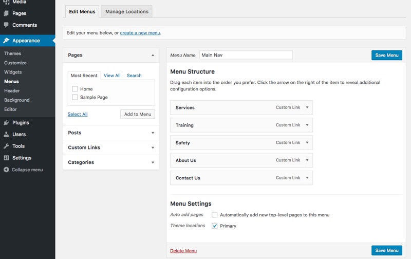 Out of the box WordPress has a handy menu builder that is completely dynamic
WordPress has built-in functionality to display custom menus virtually anywhere inside a theme. The goal of these menus are to offer dynamic editing capabilities if the author/publisher of the website wants to move pages around inside the menu itself or even rename pages. By default, WordPress supplies you with one menu and one menu location.
Creating, Editing, and Displaying Menus

If you need more menus you have to click create a new menu. This creates a new instance of a menu in which you can rename and add content as you please.
Chances are, if you need to create a new menu, you need somewhere special to display it. Maybe, for example, the footer of your website will have a few more links than the primary navigation. To provide support for this you need to create a new menu, add the necessary pages/links, and then choose the appropriate location.
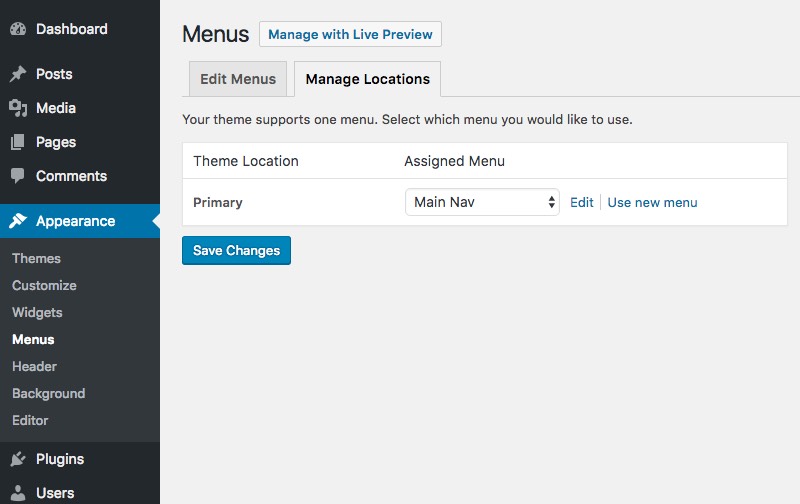 One menu location shown
WordPress only supplies one location to start with so from here you need to head to your functions.php file and find the block of code below:
register_nav_menus( array(
  'primary' => esc_html__( 'Primary', 'yourwebsite' ),
) );
This function initiates the primary menu we just took a look at. To create a new one simply copy the block of code and paste it below. Be sure to rename this menu similar to below. You can name it whatever suits your theme best:
register_nav_menus( array(
  'footer' => esc_html__( 'Footer', 'yourwebsite' ),
) );
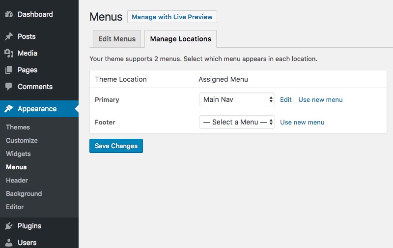 After adding the function you will see a new location display in the UI.
Displaying the menu is fairly simple. WordPress has a handy function for displaying these in your theme. Add the code below to your header as it will be our primary nav. If you’re working on an existing theme, chances are this function already exists in your header.php file.
<?php wp_nav_menu( array(
  'menu'=> 'primary',
  'theme_location'    => 'primary'
?>
At the most minimal level, we have successfully displayed our primary menu which is completely dynamic. Nice!
How to Integrate Bootstrap
If you don’t need a CSS framework like Bootstrap you should be all set to style your menu as you please. In my own case, I needed to make use of Bootstrap due to time constraints and overall general browser support.
I make use of Sass so I downloaded the ported version to my computer and added to my theme. From there I was stuck as I had no way to really rebuild the menu without hacking the menu code itself to include the necessary markup and classes Bootstrap famously makes use of. This is about the time I took to Google…
I did some Googling and came across a Github repo that was the exact answer I was looking for. Thanks to Edward McIntyre for this awesome contribution.
Edward built a new navigation walker that integrates Bootstrap (3.0+) into the WordPress menu manager. The repo consists of single file called wp_bootstrap_navwalker.php that creates a new class in which you can assign inside the wp_nav_menu() function. The result of the initiating the class would look similar to the block below:
<?php
    wp_nav_menu( array(
        'menu'              => 'primary',
        'theme_location'    => 'primary',
        'depth'             => 2,
        'container'         => 'div',
        'container_class'   => 'collapse navbar-collapse',
            'container_id'      => 'bs-example-navbar-collapse-1',
        'menu_class'        => 'nav navbar-nav',
        'fallback_cb'       => 'wp_bootstrap_navwalker::fallback',
        'walker'            =>  new wp_bootstrap_navwalker())
    );
?>
Note the line 'walker' => new wp_bootstrap_navwalker() parameter. This is all completely custom and completely useful!
If you peek inside the wp_bootstrap_navwalker.php file Edward shared you may find some markup that looks familiar if you make use of Bootstrap already.
Edward created a class that outputs the necessary markup and classes in order to display a Bootstrap navbar correctly using WordPress’s built-in menus. It also conveniently allows you to define customer parameters such as the depth of the menu levels as well as custom container classes and fallbacks.
When I found this I was pleased, to say the least!
Including the new Class
To include the wp_bootstrap_navwalker.php file you simply need to add it to your theme and require it inside your functions.php file.
// Register Customer Navigation Walker
require_once('wp_bootstrap_navwalker.php');
Adding it to your theme
To include the new menu in your theme you still need to make use of some of Bootstrap’s native markup. The resulting code of this is below:
<header id="masthead" class="site-header" role="banner">
    <nav class="navbar navbar-default" role="navigation">
      <div class="container-fluid">
        <!-- Brand and toggle get grouped for better mobile display -->
        <div class="navbar-header">
          <button type="button" class="navbar-toggle" data-toggle="collapse" data-target="#bs-example-navbar-collapse-1">
            <span class="sr-only">Toggle navigation</span>
            <span class="icon-bar"></span>
            <span class="icon-bar"></span>
            <span class="icon-bar"></span>
          </button>
          <a class="navbar-brand" href="<?php echo home_url(); ?>">
                    <?php bloginfo('name'); ?>
                </a>
        </div>

            <?php
                wp_nav_menu( array(
                    'menu'              => 'primary',
                    'theme_location'    => 'primary',
                    'depth'             => 2,
                    'container'         => 'div',
                    'container_class'   => 'collapse navbar-collapse',
            'container_id'      => 'bs-example-navbar-collapse-1',
                    'menu_class'        => 'nav navbar-nav',
                    'fallback_cb'       => 'wp_bootstrap_navwalker::fallback',
                    'walker'            => new wp_bootstrap_navwalker())
                );
            ?>
        </div>
    </nav>
</header>
We still made use of some basic HTML but also include the wp_nav_menu() function to output any pages that are within the primary menu. The function makes use of the supplied wp_bootstrap_navwalker() class instead of the default WordPress class. From there, assuming you already included Bootstrap’s core CSS and JavaScript files your header should be set up to make use of Bootstrap!
Resulting Look and Functionality
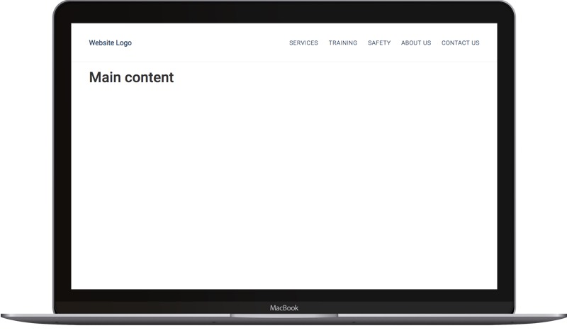 The result on Desktop
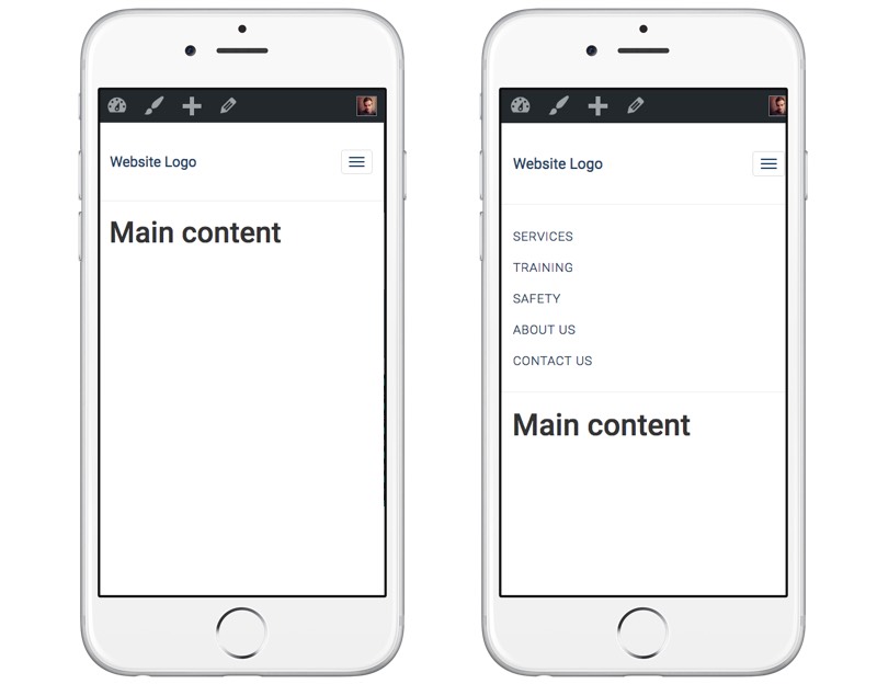 It even works on mobile (as it should :) )
Categories
Products and courses
-
Hello Hotwire
A course on Hotwire + Ruby on Rails.
-
Hello Rails
A course for newcomers to Ruby on Rails.
-
Rails UI
UI templates and components for Rails.
